Scatter Plot
登录后可下载

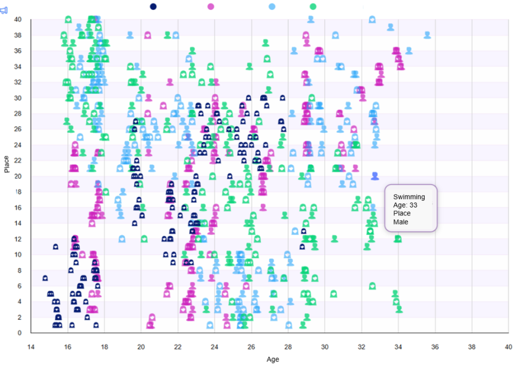
The Scatter Plot Chart shows the relationship between two numerical variables, demonstrates the correlation between a large amount of data.
散点图显示了两个数值变量之间的关系,展示了大量数据之间的相关性。
Unlike similar charts from other developers, the elements displayed on the Scatter Plot can show the relationship between more than two variables.
与其他开发人员的类似图表不同,散点图上显示的元素可以显示两个以上变量之间的关系。
The Chart solves the following problems:
该图表解决了以下问题:
1. Identifying correlations and patterns Allows you to easily determine whether there is a relationship between two variables (positive, negative, non-linear).
1. 识别相关性和模式 允许您轻松确定两个变量(正、负 、 非线性 )之间是否存在关系。
2. Detecting outliers (anomalies)
2. 检测异常值(异常)
Point display of data helps to quickly identify abnormal values that deviate from the general distribution.
数据点显示有助于快速识别偏离一般分布的异常值。
3. Analyzing data distribution
3. 分析数据分布
Shows how data is grouped or scattered:
显示数据如何分组或分散:
4. Working with large amounts of data
4. 处理大量数据
Efficiently displays thousands of points without losing readability (in
高效显示数千个点,而不会失去可读性(在
5. Multivariate analysis
5. 多变量分析
6. Exploring non-linear dependencies
6. 探索非线性依赖关系
Shows complex relationships that are difficult to detect in tables or line graphs.
显示难以在表格或折线图中检测到的复杂关系。
7. Flexibility and interactivity
7. 灵活性和交互性
The Chart capabilities are expanded by the functionality of displaying a data type point in various shapes, for example, man, woman.
图表功能通过以各种形状显示数据类型点(例如男性、女性)的功能进行了扩展。